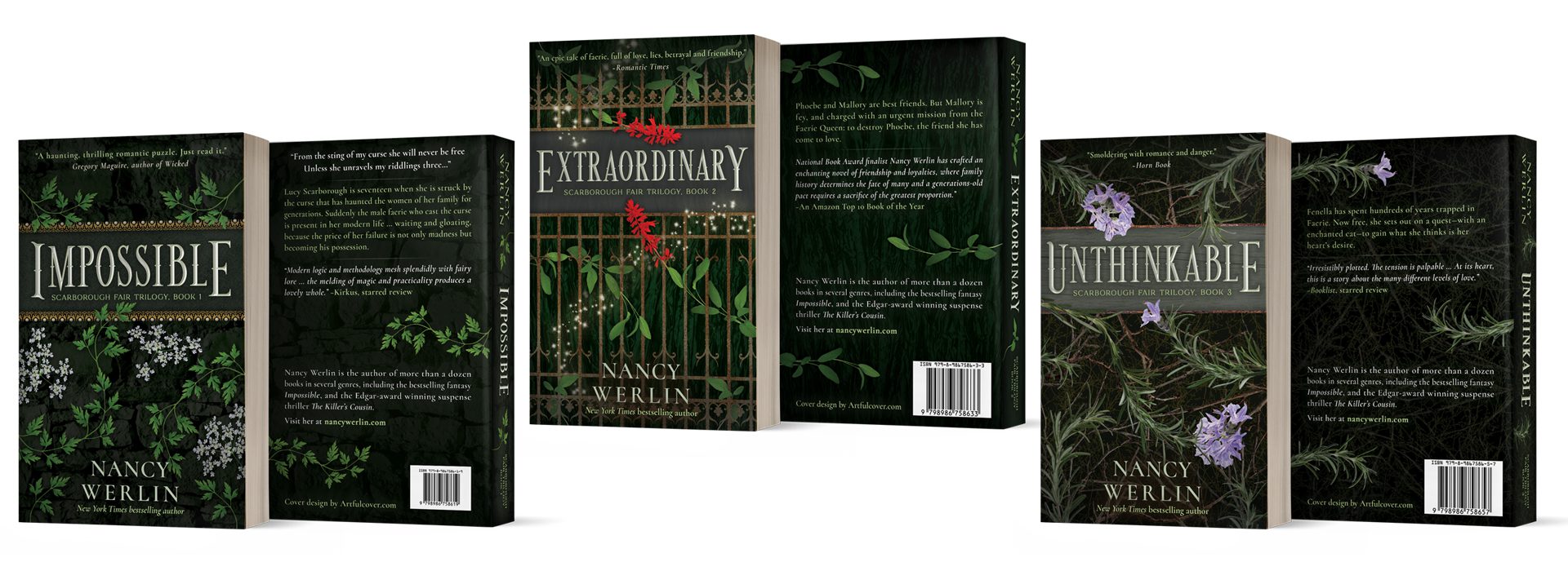
Book Series Rebranding: Scarborough Fair Trilogy
Project Overview
Objective: Book series rebranding of a YA fantasy series
Client: Author Nancy Werlin
Duration: Approx. 4 months
Work Details: Design covers for three books (including ebook, paperback, hardcover for two different vendors, and audiobook) plus Amazon feature background graphics
Primary Challenge: Design genre-friendly covers for a cohesive and timeless look, with marketable series branding strategy for both YA and adult categories
The Project
When Nancy Werlin gained the rights for her Scarborough Fair Trilogy from the publisher, she wanted a more mature — and a bit darker — look for the book series rebranding. Like the books, she thought the covers and series concept should blur the line between YA and adult categories, and take on a more timeless iconic character, yet still suit current trends in the genre.
With the classic song as inspiration, we focused on the herbs and flowers of parsley, sage, and rosemary as the unifying theme of the designs. And, since the fae factor heavily in the stories, I wanted to balance natural organic material (wood, stone, and metals) with glints of glamor and magic to build the backdrops and design elements.
The Series Concept
Nancy wanted to keep a timeless look, yet not feel out of step with current genre trends. An iconic style using the flowers and herbs of the classic song as the focal point, rather than an accent, fit both objectives beautifully.
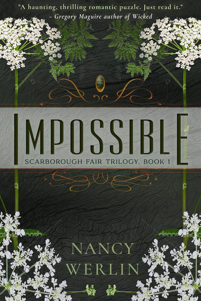
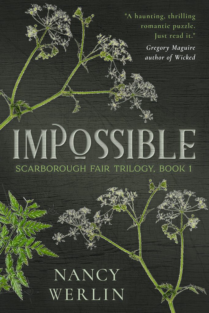
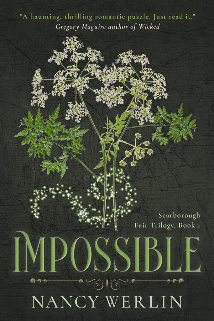
With the herb and flower of the parsley plant as the primary design motif, and the objective to create a darker and more mature look, I tried a few different concept styles: a more organic scene evoking climbing ivy, a framed look with a hint of art nouveau, a scattered broken-style theme, and a bouquet “tied” with magic.
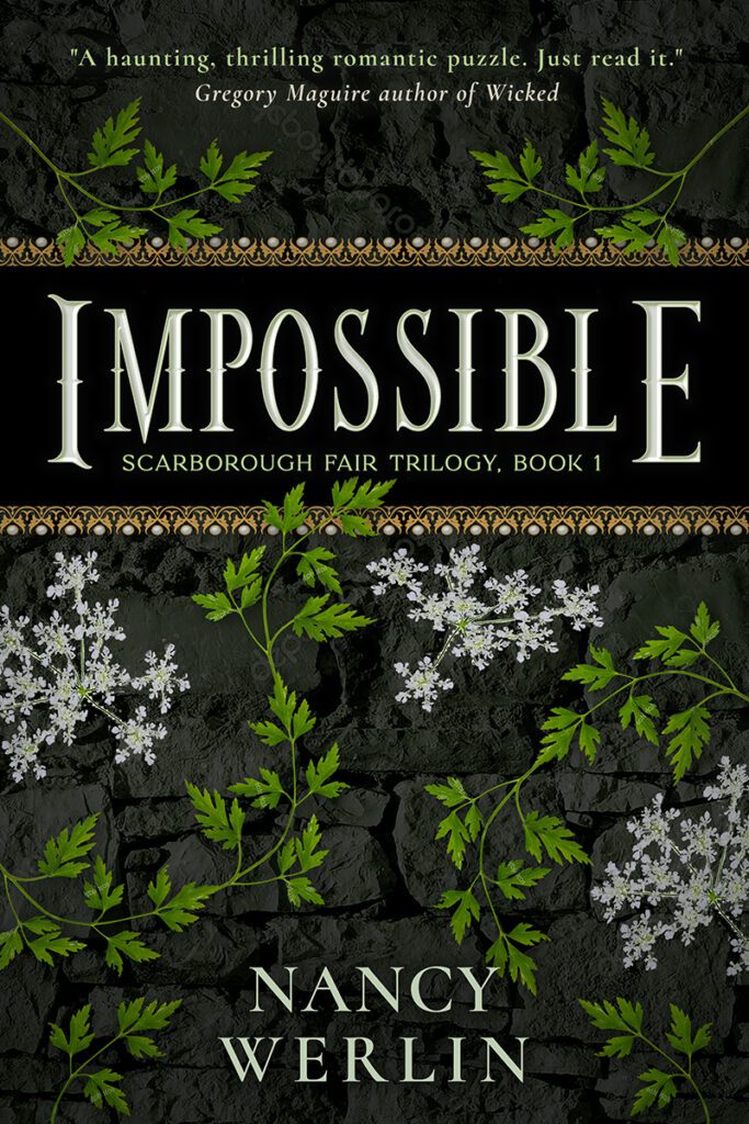
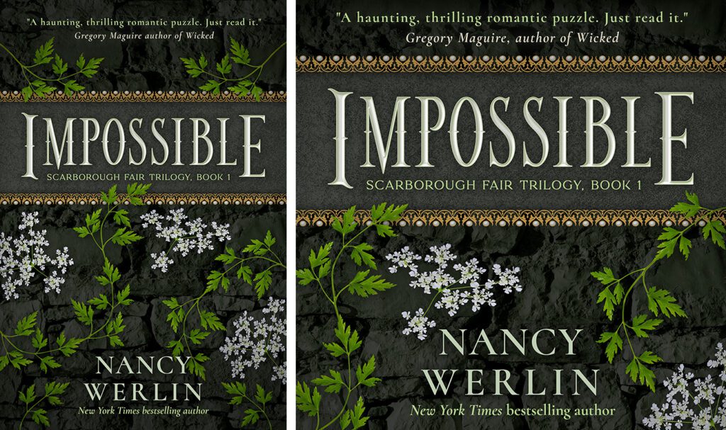
The fae play a significant role in the series, so in all the initial rough drafts for the first book’s cover — which would establish the branding for the trilogy — I balanced raw elements with touches of bright elegance and darkness. For this cover, I used black stone as a backdrop with touches of gold and pearls.
Revisions & Audiobook Design
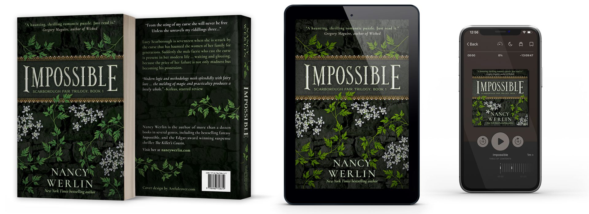
Nancy loved the first concept as-is, so finalizing the design was just a matter of polishing up the imagery and effects.
With a largely open layout, compressing the ebook cover for audiobook was unusually easy — rather than sacrifice the bold, beautiful title banner, I simplified the rest of the design.
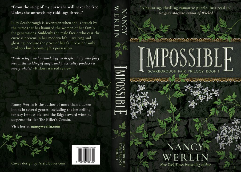
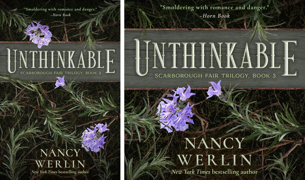
Paperback Cover Design Draft
With the front cover of the paperback rich with flowers and gold-and-pearl trim, I wanted to keep the back relatively low-key, so used two-color text with parsley “ivy” dividers.
To keep the darker, low-key feel of the back but still give the spine eye-catching visual intrigue, I used the natural angles of the author’s name and series text to shape the pattern of accenting parsley sprigs flanking the title.
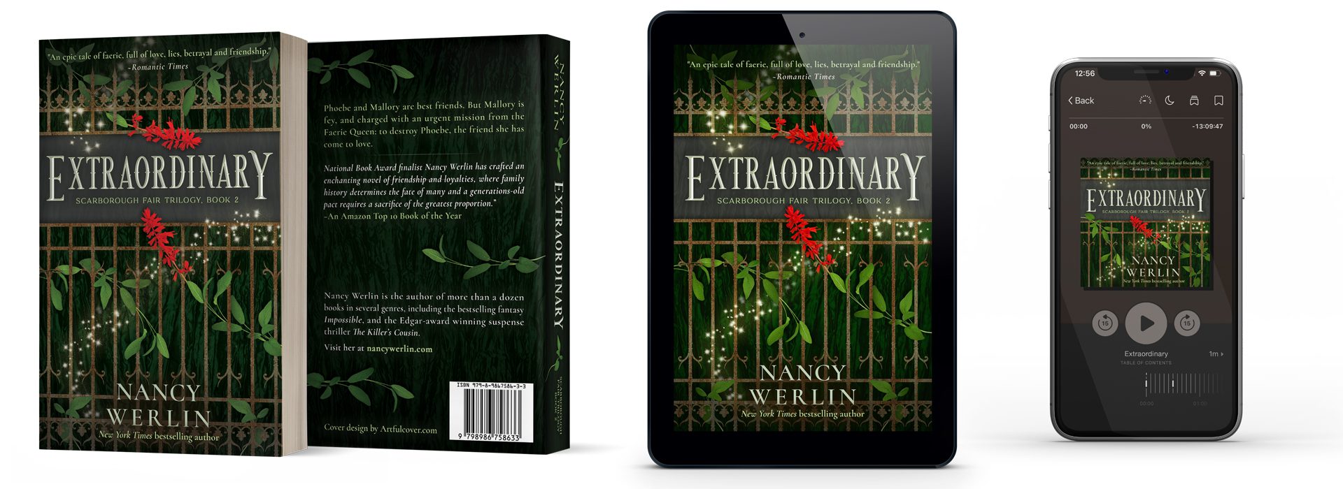
The final paperback, ebook, and audiobook covers
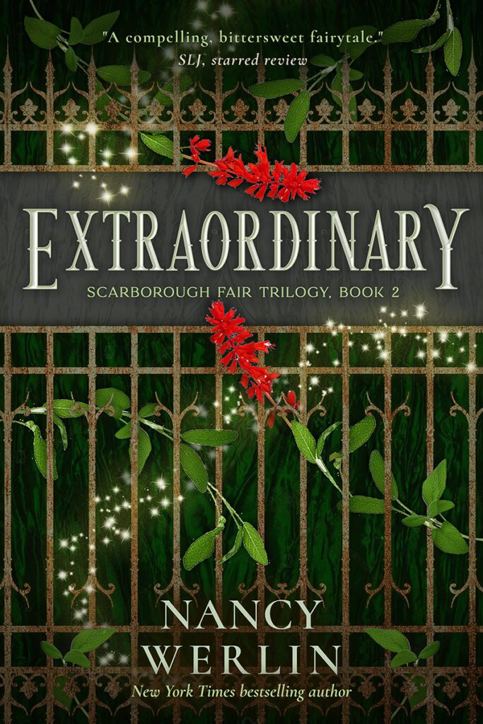
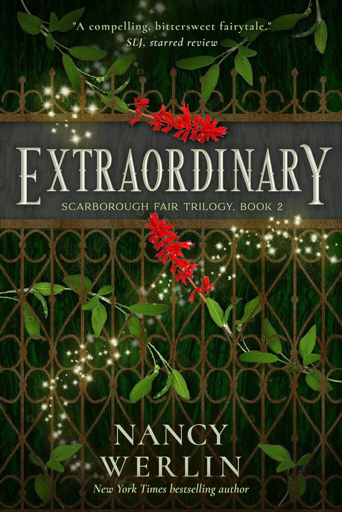
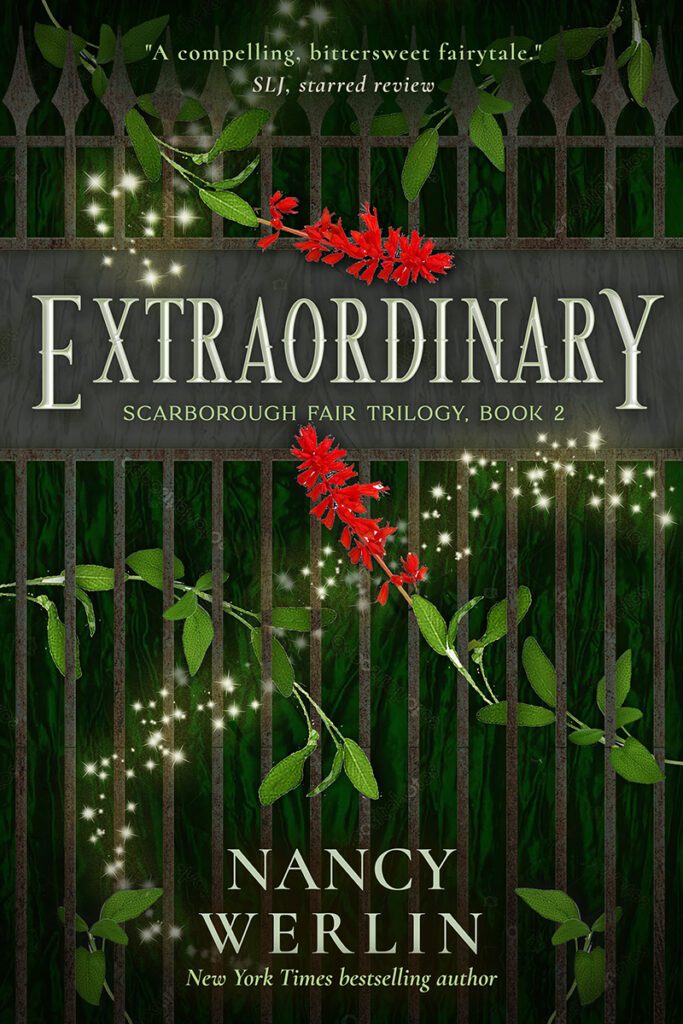
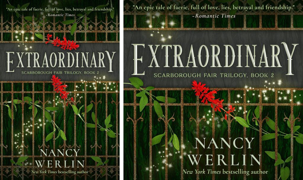
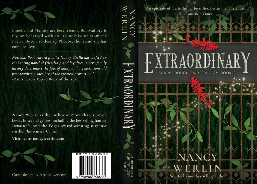
Extraordinary
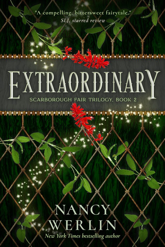
To establish a consistent series brand, I kept the strong framed title banner, as well as retaining the blurb and author text layouts and styling. The fae influence is strong in this book, so I also wanted to build on the wild, natural feel of Impossible with more green and overtly magical elements.
While book one featured the imposing barrier of a stone wall, as the world of the fae opens more to the reader, I wanted a barrier that allows a peek within but still evokes warning. So I used different fence motifs — ranging from Fabergé-inspired chainlink and ornate patterns to simple spiked posts — and added some weathering and rust to suggest the gate to a fae portal hidden deep in the woods.
With sage as the primary design element, I used the bold red flowers to create a focal point on the title banner. Green herbs snake in and out of the rusted fence before a green and black patterned backdrop, with magical waves of sparkling faerie dust weaving though the scene, a touch of dynamic drama to connect the text elements.
Revisions & Audiobook Design
With no major revisions requested for the selected draft, completing the ebook was once again a matter of perfecting the existing design and fleshing out the right effects to enhance the overall look.
For the audiobook, I used the same strategy as in book one: simply homing in on the title banner and its flanking elements, adjusting where needed to ensure text legibility.
Paperback Cover Design Draft
For the paperback draft, as in the other versions, the branded style of Impossible largely determined the layout strategy of Extraordinary. Like the parsley flowers, red sage is a dominant element that risked distracting from text elements on the back cover. So I stuck with using just the herb as a divider of the two-color text blocks and accent on the spine.
The final paperback, ebook, and audiobook covers
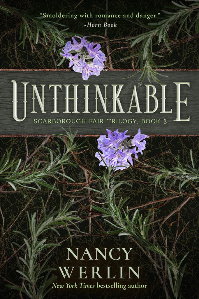
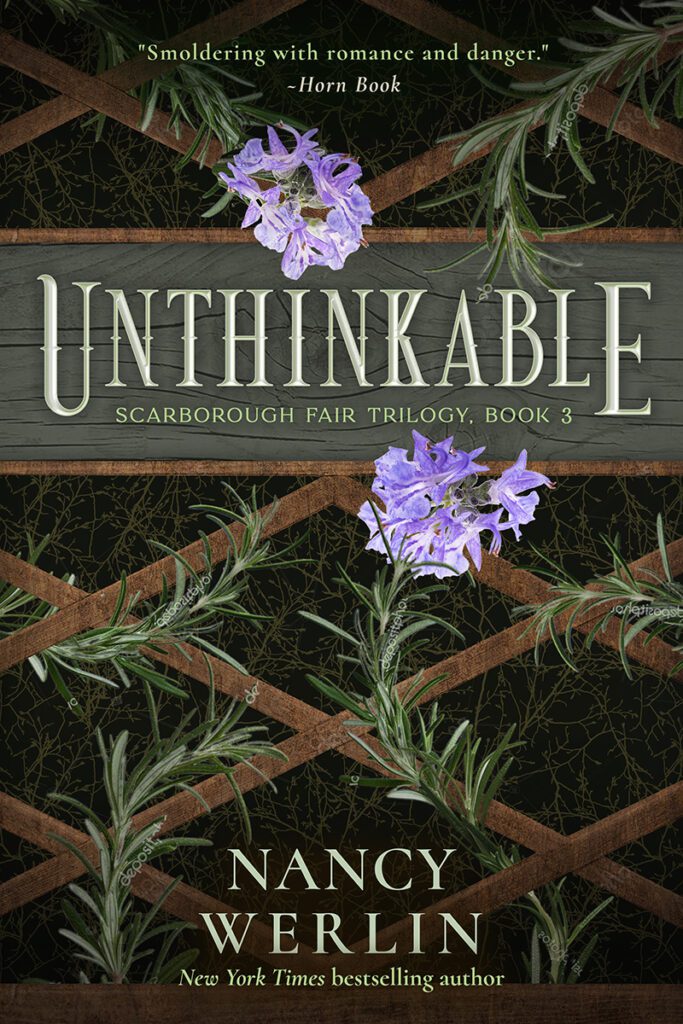
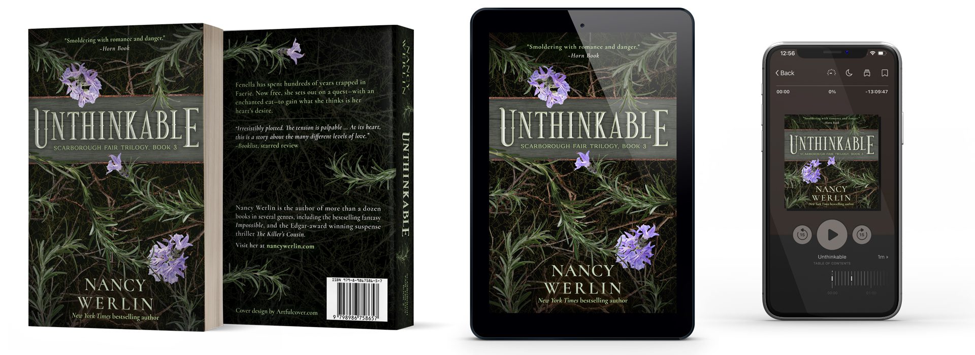
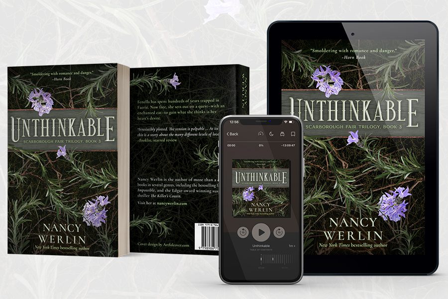
Unthinkable
Following the trend of the first two books, I leaned further into green—with purple rosemary flowers, it offered the perfect color foil. And with even more fae influence in the book, I wanted the barrier, if I used one at all in the scene, to be quite open to reveal as much background natural texture as possible.
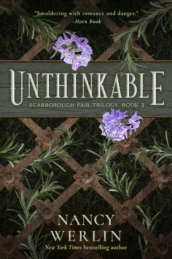
With rosemary as the primary design element, I already had a natural linear element and a striking contrast with the base of deep green tones. In addition to a barrier-free design with extensive branch and bramble textures meant to evoke the feel of an enchanted fae forest, I focused on prettier and more delicate grids as the backdrop.
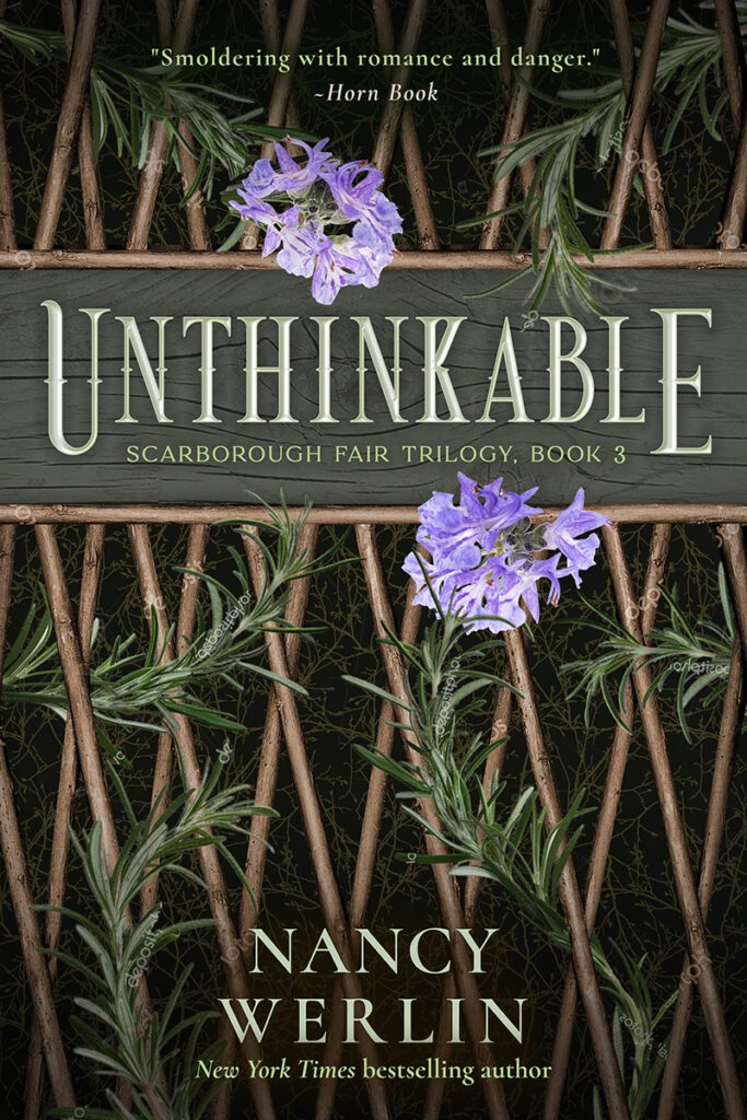
The fae play the most significant role in this story, so I wanted all natural organic elements in the design. In each concept draft, the title banner framing and accent elements are wood. For designs with barrier grids, instead of the enchanted forest feel, I used open diagonal grids of varying detail to evoke trellises of a mad, wild garden.
Revisions & Audiobook Design
Much to my glee, Nancy preferred the enchanted forest concept. As before, there were only minor revisions from the rough draft. Mainly, I added a flower and some herbs, along with textural elements behind the author text to soften the gap in the background there.
For the audiobook, I couldn’t resist shifting the big purple flower upward to add more contrast with the background and title banner. Otherwise, the strategy was on-point with the previous two books.
Paperback Cover Design Draft
With the background for the front cover being a bit pattern-intense, to keep on-brand and retain legibility, I dialed back quite a bit on the branches as a soft accent to the bramble texture. The only departure from previous series branding is the wee purple blossom adding a pretty pop of contrast on the herb dividers.
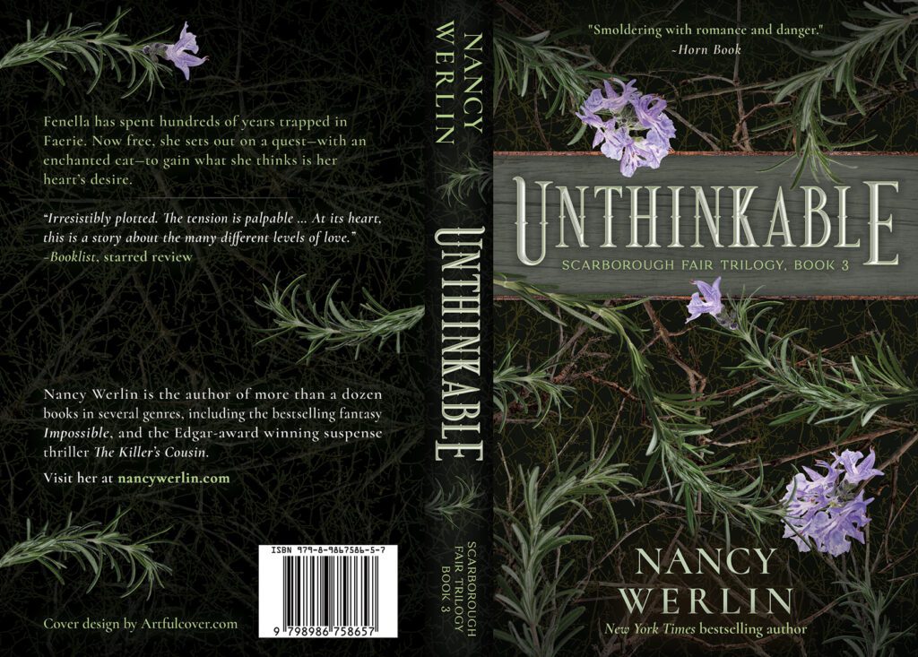
The final paperback, ebook, and audiobook covers
The Scarborough Fair Trilogy
Amazon Feature Background Graphics
In addition to the various media covers, I also created background graphics to be used in quote banner features for the books’ Amazon pages and listings on other online vendors. To offer engaging visuals that suited a wide range of quotes and promotional text, I captured different levels of background design — from open texture to graphics that allowed snippets of text on smaller areas to form patterned designs. Below is a small sampling of the banners for each of the three books.
Impossible


Extraordinary


Unthinkable


Get In Touch!
Thanks for checking out my site! To reach me, click the violet text below to copy my email address to your clipboard or use the button to go to my contact form.