Book Series Branding Design & Custom Book Cover Design
When a picture needs to be worth 100,000 words…
At its best, a book cover acts as a visual representation of the author’s story, as well as its genre, mood, and themes. It must be true to the product or risk causing disappointed reviews. The need to stay on point to the material and genre norms grows exponentially when designing the look or brand of a series.
When an author wants to expand a book cover concept into a series branding design, the elements we carry over could make a big difference in reader perception and, ultimately, sales. In the planning and concept stage, I collaborate as closely as possible with the author to create a look that communicates the type of read potential buyers can expect.
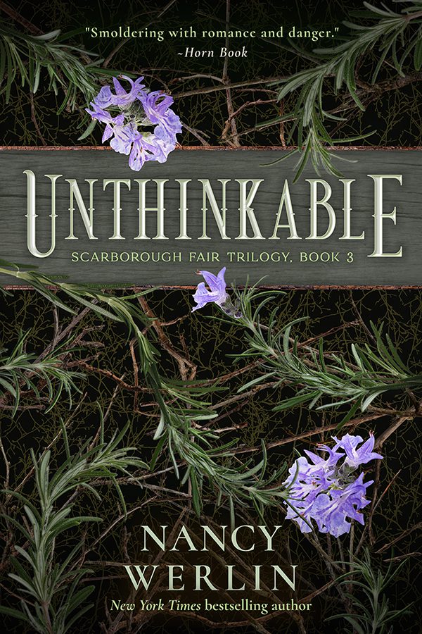
Scarborough Fair Trilogy
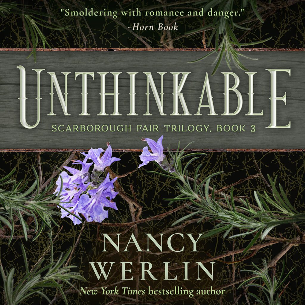
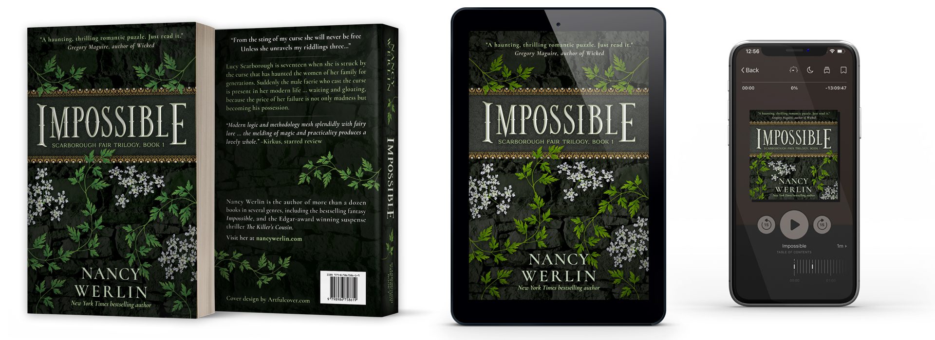
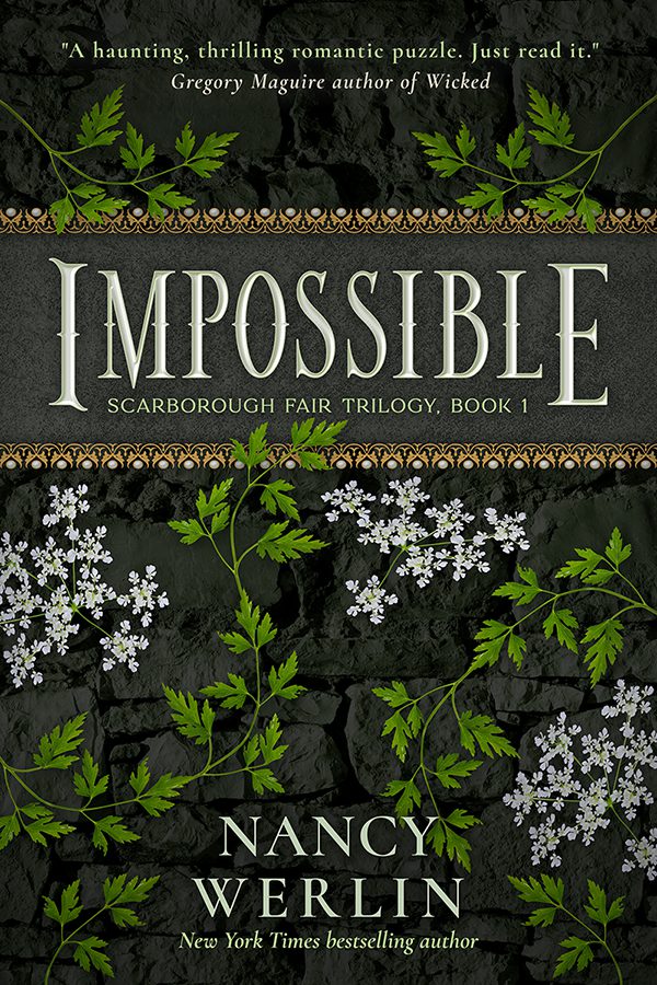
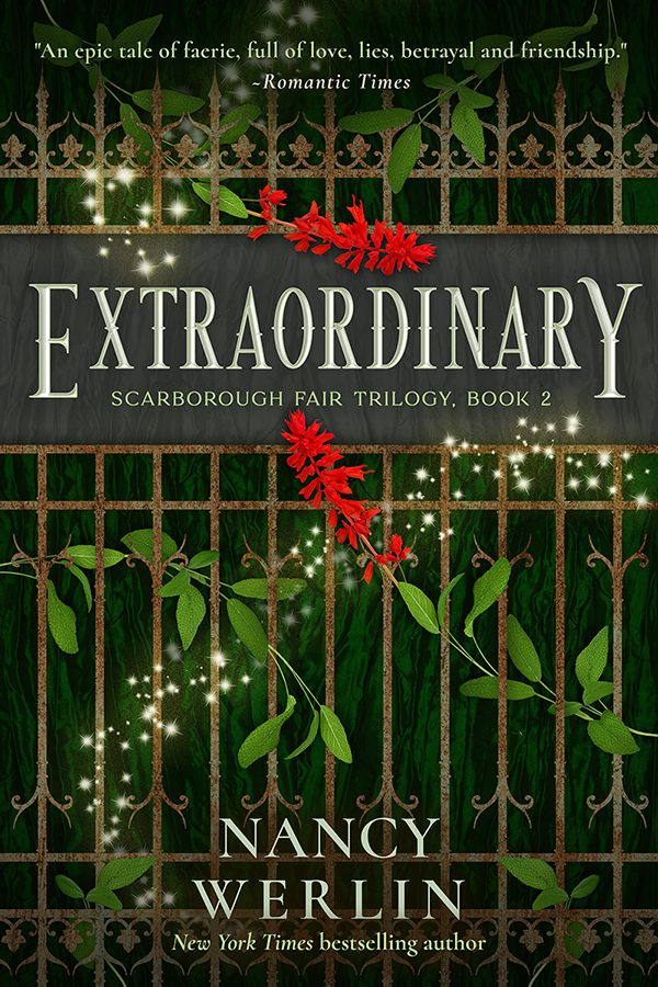
When Nancy Werlin gained the rights for her Scarborough Fair Trilogy from the publisher, she wanted a more mature — and a bit darker — look for the series. Like the books, she thought the covers and series concept should blur the line between YA and adult categories, and take on a more timeless iconic character.
With the classic song as inspiration, we used the herbs and flowers of parsley, sage, and rosemary as the focal point of the designs. And, since the fae factor heavily in the stories, I wanted to evoke the feel of an enchanted forest, so used natural organic material (wood, stone, and metals) alongside glints of glamor and magic to build the backdrops and design elements.
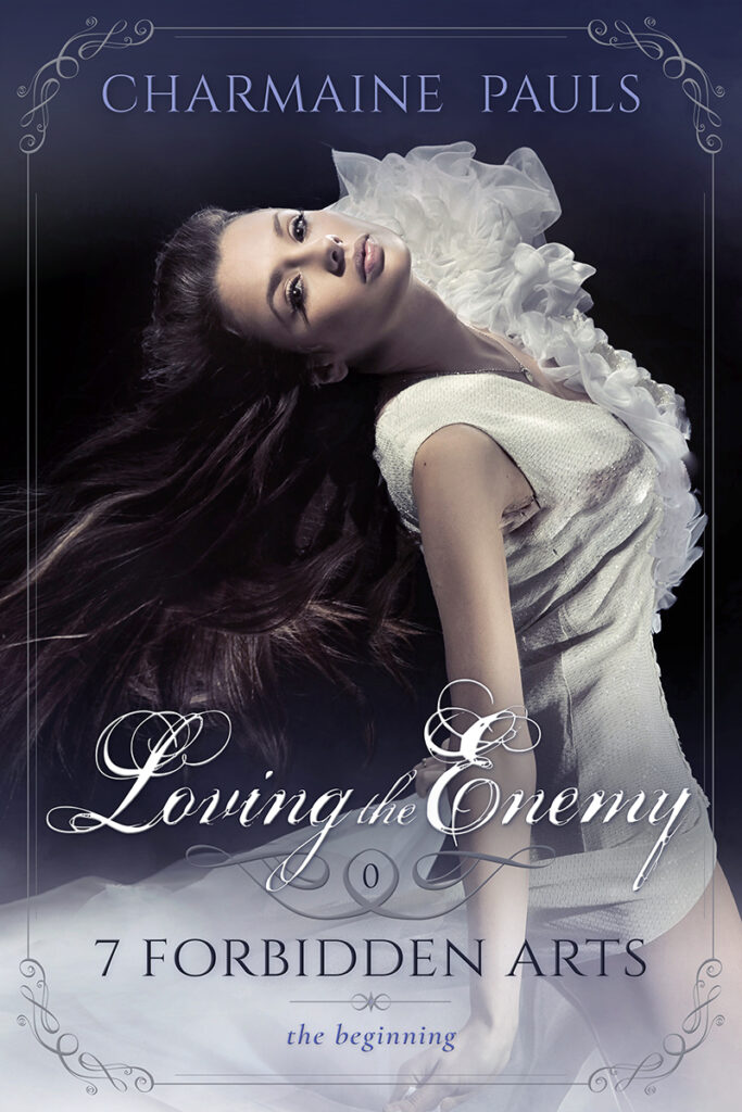
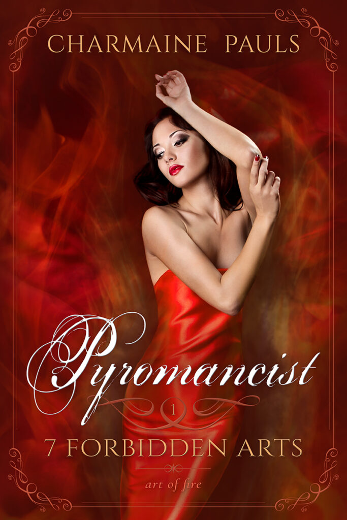
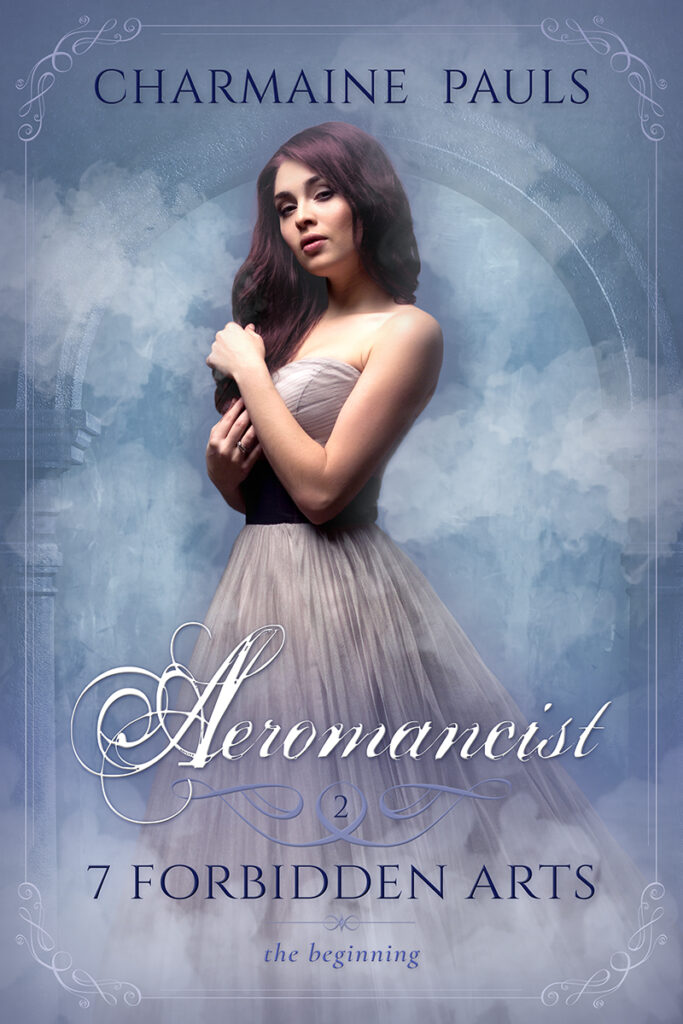
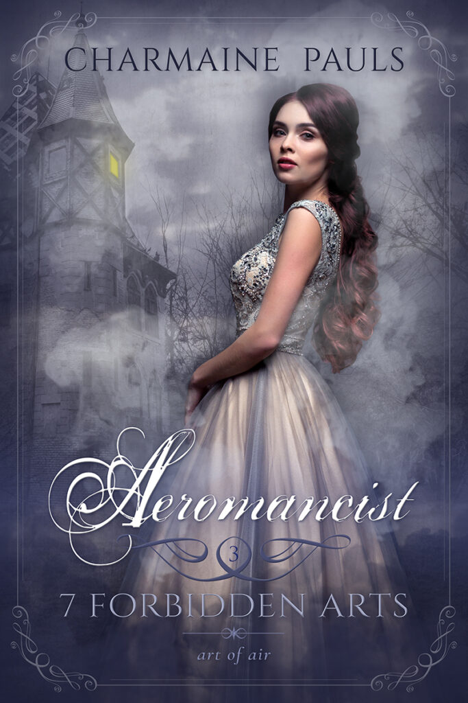
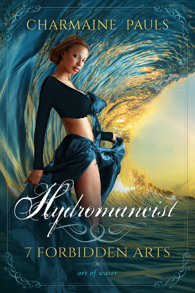
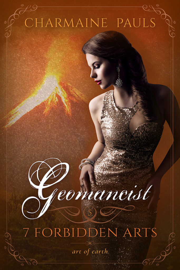
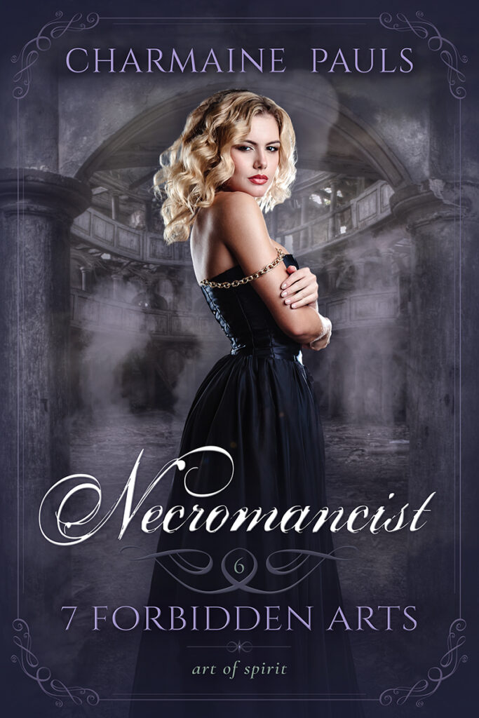
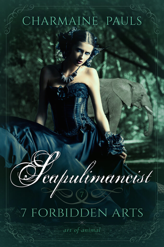
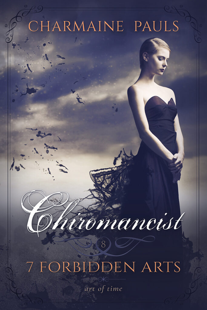
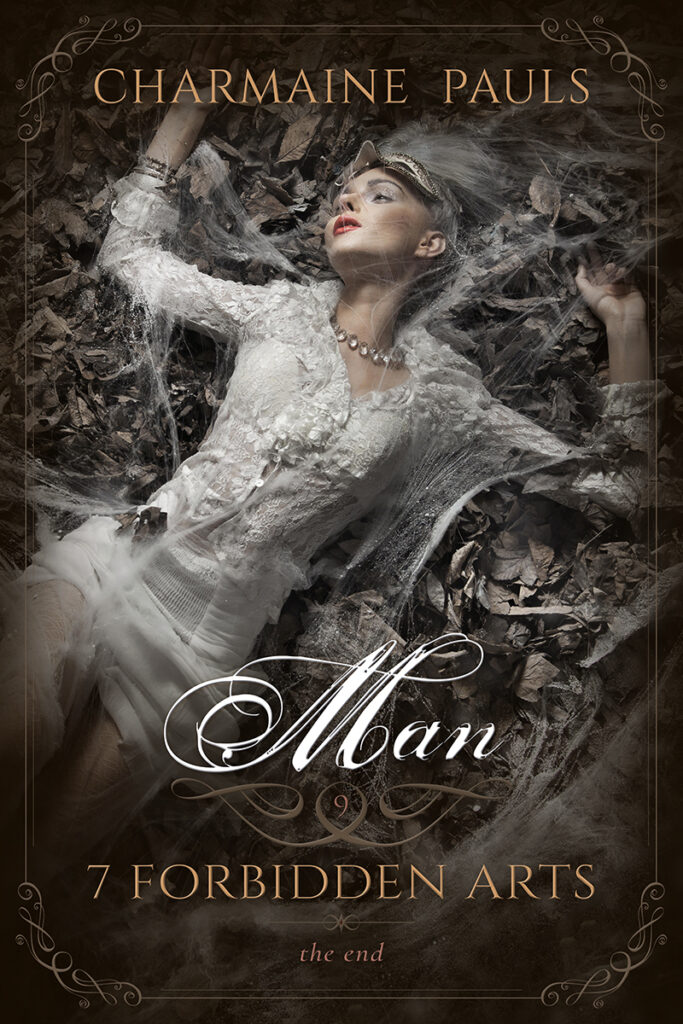
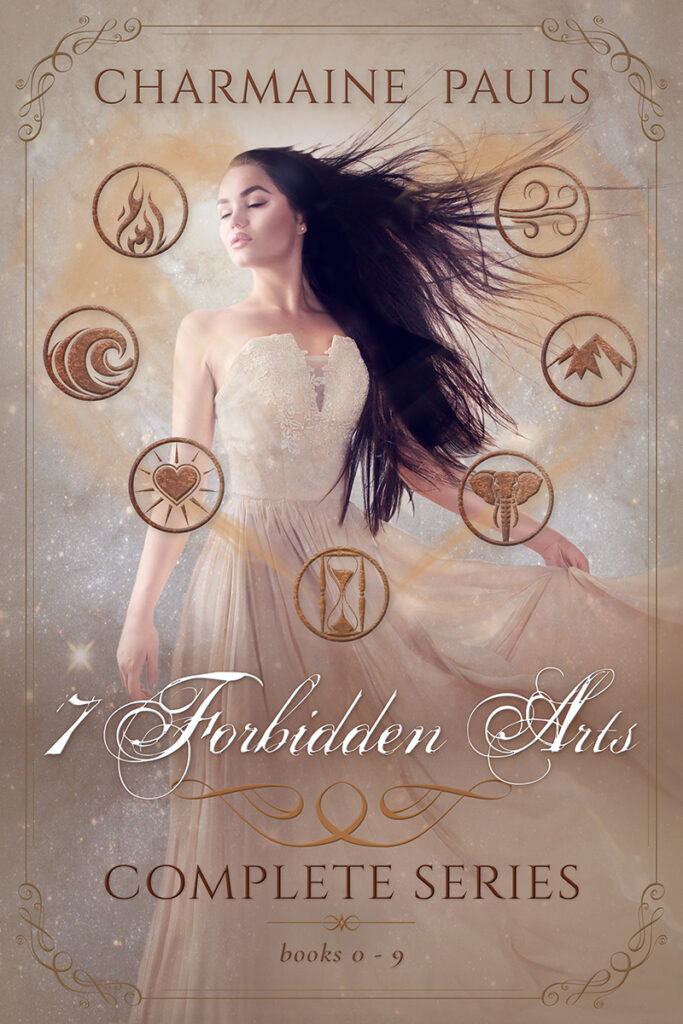
7 Forbidden Arts
While Charmaine Pauls’s publisher had chosen a style of book covers that branded her 7 Forbidden Arts series with visual tropes of erotic fiction, she wanted to highlight their paranormal romance aspects. So I collaborated with her to expand the premade book cover she’d selected as the foundation look into a ten-book series and box set.
High in my priorities was underpinning all the cover graphics with lush imagery, dreamlike fantasy backdrops, and the elegant sophistication of classic romance.
For a detailed recounting of the design process, please see the book series branding case study.
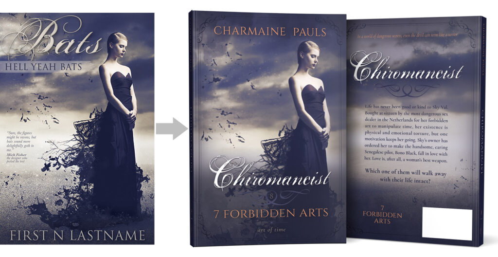
Chiromancist
To turn “Bats” into “Chiromancist” and create the series branded style, the first step was to move the title down to accommodate a variety of photos over eleven covers. Then I added a splash of color to the stark backdrop and text. Last, I used the title block ornament to build a subtle frame element that brought in a touch of old-school romance elegance.
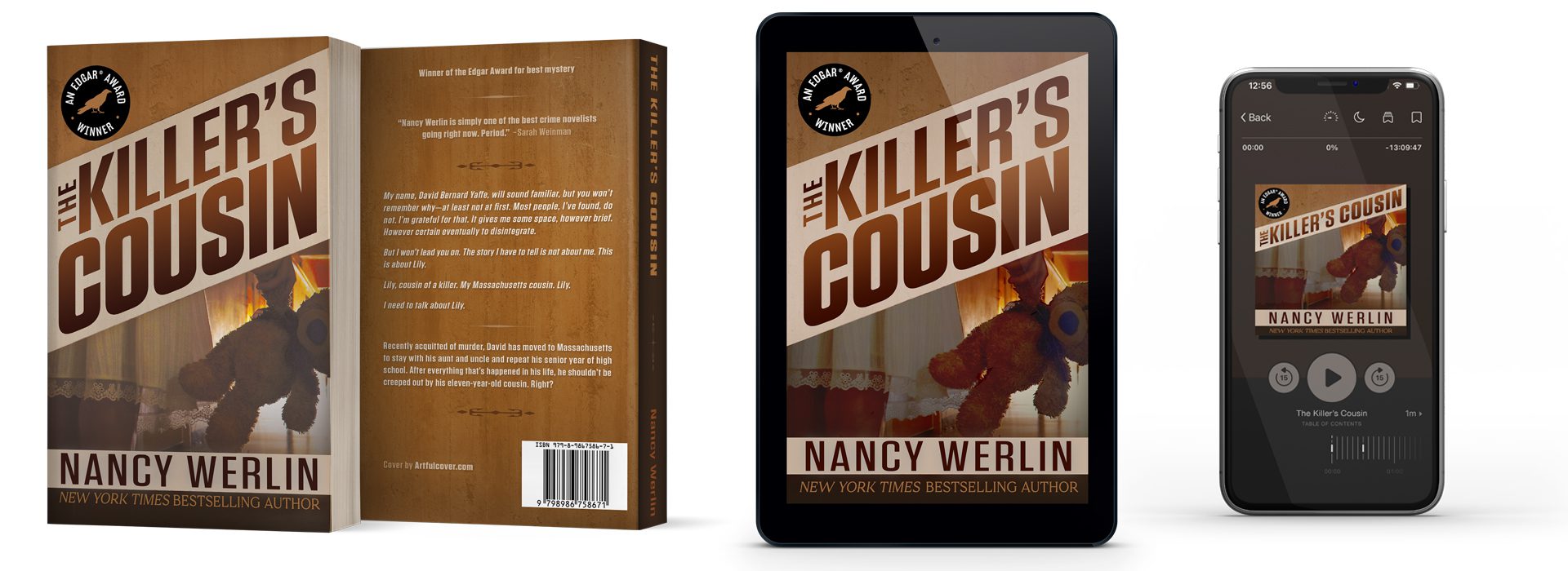
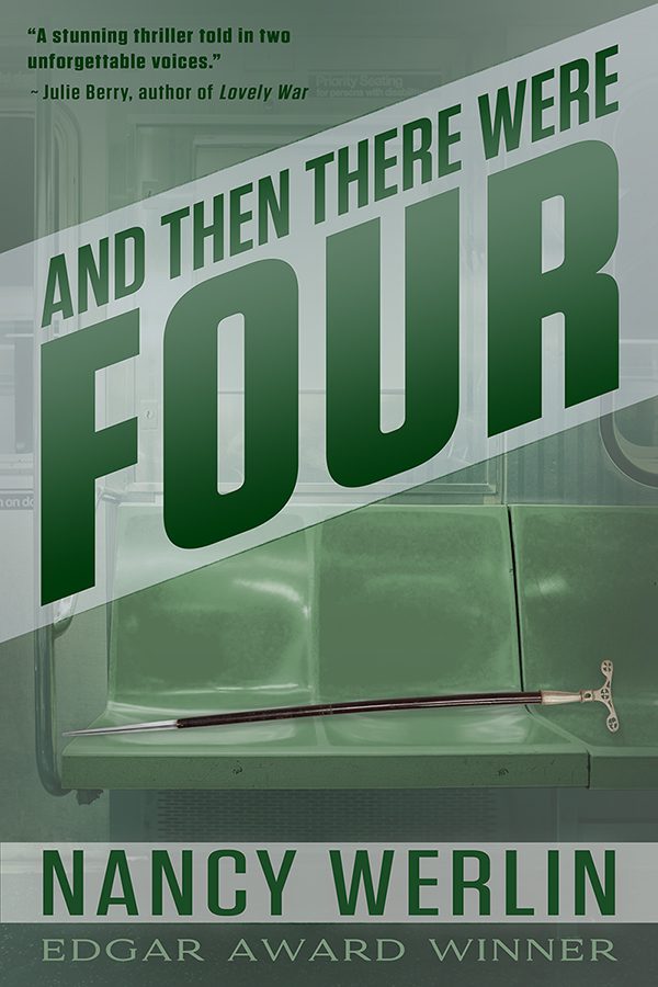
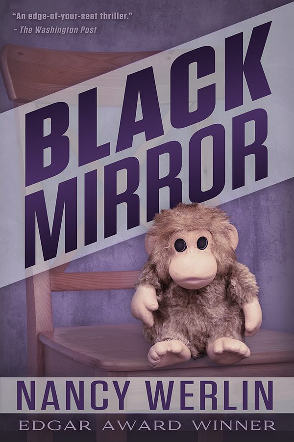
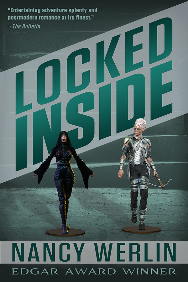
Nancy Werlin Thrillers
Like her Scarborough Fair Trilogy, Nancy Werlin’s series of thrillers had been through a few iterations of cover design. She wanted a simpler, more classic iconic look that would feel more timeless and less apt to seem trendy or dated.
So I designed a concept built around key evocative elements of the books using a different bold wash of color for each cover. For the titles, I stuck to classic suspense/thriller tall, beefy block lettering, but added a light background banner at a dramatic skew to give them a more dynamic look.


The Control Series
The Control Series — a slow-burn romance set over a decade into a zombie apocalypse — presented some interesting challenges. John West wanted to create images that felt true to the dystopian world depicted in the novels, but leaning too far into the action-adventure aspect of the stories risked setting the wrong genre expectations. Instead, I simply used the chaotic destruction of the characters’ world as a backdrop and depicted them facing the danger together. Strong and blocky modern sans text and sleek modular divider elements completed the look.
As we expanded the series, we kept the same concept, but added a new found family member and some changes of scenery.
For more details on the development process, check out the Custom Book Cover Design case study on the book series branding design.

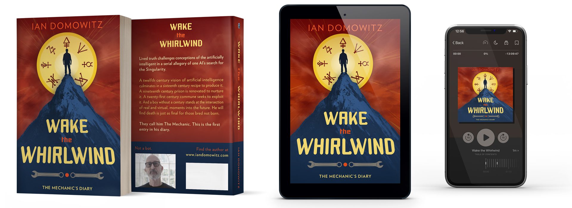
The Mechanic’s Diary
With a uniquely surreal concept that blends modern tech with ancient mythology and alchemy, trying to capture the settings and characters of The Mechanic’s Diary seemed like it’d detract from the cool premise. Instead, I created a picture that depicts the idea of the young main character’s imaginative power in a treatment that hearkens back to iconic old-school science fiction cover art in bold primary colors.
As the series has expanded, we’ve kept the unnatural setting of the initial cover, and extended the world to include new monsters and antagonists.

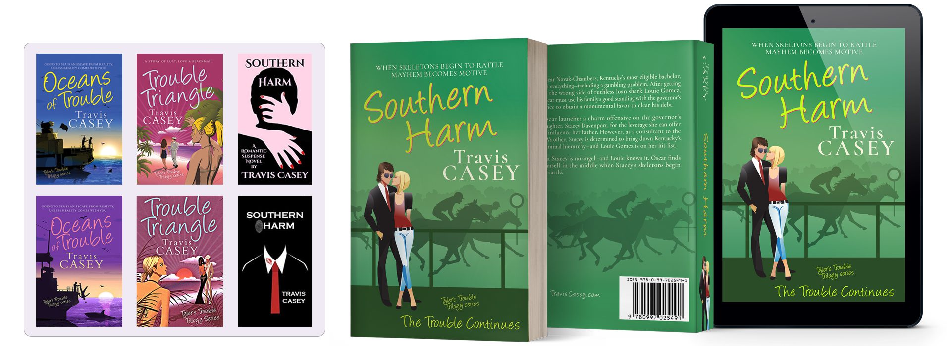
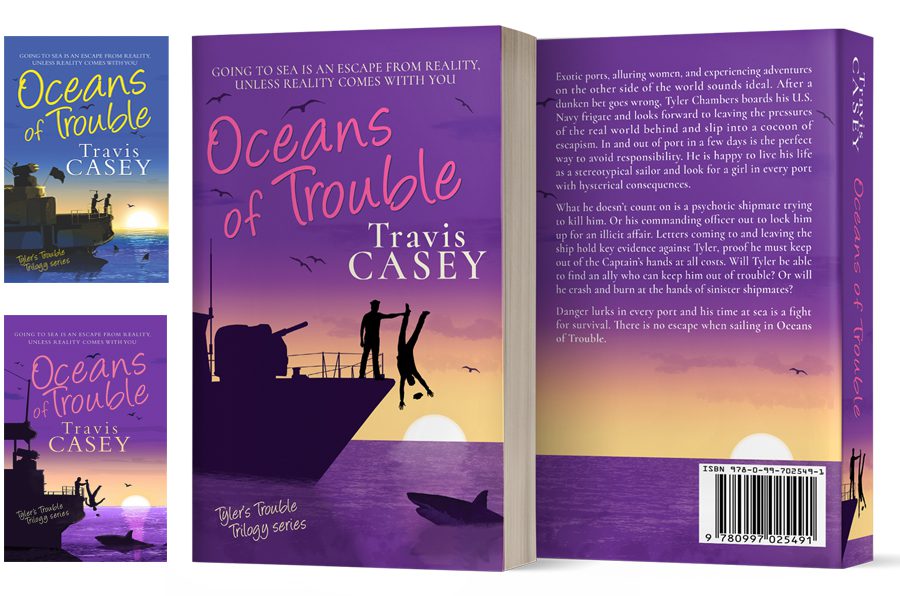
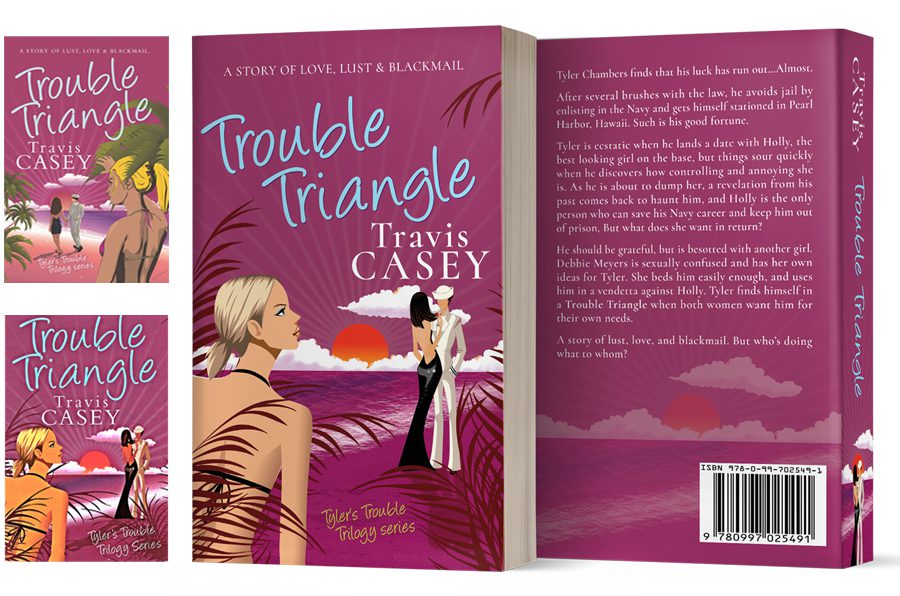
Tyler’s Trouble Trilogy
My series work on the Tyler’s Trouble Trilogy was a relatively common situation for freelancers — continuing another designer’s project. To keep the look of Southern Harm consistent with the previous covers, I sought out illustrations in a similarly whimsical style and used a bright palette of bold colors.
As luck would have it, my work on the series took another design-challenge direction — Travis wanted new paperbacks of the older books, so I wound up working on updated recreations of two of the three books in the original trilogy.
Travis wanted to add a related book to the existing series, but the covers of Southern Harm didn’t jive with the book series branding. So a designed a cover that — like the book — is the next generation of the series, with similar character art and a vibrant color scheme but a more modern, streamlined look.
Later, Travis wanted to promote the expanded series at events, but the older books had different covers for ebook and print versions with inconsistent quality levels. So he enlisted me to recreate the covers in a consistent design for both formats. In some cases, similar to identical stock art was still available — in other cases, I edited new art or created close matches by hand.
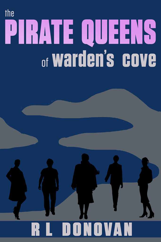
The Pirate Queens Mystery Series
Of the premades I’ve expanded into a series, the Pirate Queens Mystery Series was the most intuitive and visually bold. I love working in vivid color, especially in the iconic style of classic mysteries, so this series was a real throw-back treat to design.
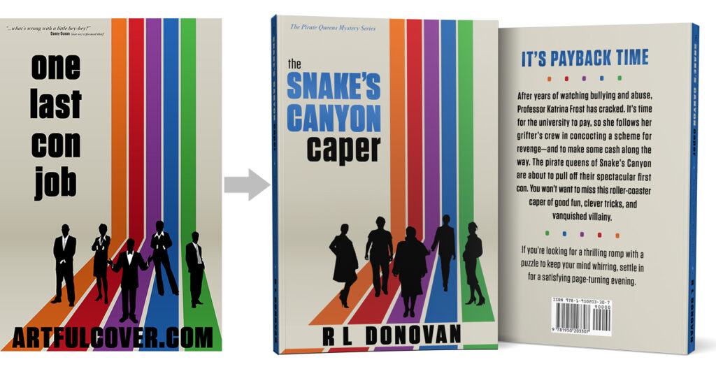
The Snake’s Canyon Caper
R.L. Donovan loved the clean iconic vibe of the original premade design, but wanted to add even more color and change the silhouettes to suit her characters. I also added a background color bar to make the author’s name pop and brought the rainbow colors and title blue into the paperback design.
The Warden’s Cove Caper
For the first drafts of the Pirate Queens series, R.L. Donovan had used their crew’s name in the books’ titles.
In building on the style of book one, I did a few rough concept sketches of ways we could continue the classic simplicity of the look. Two, the spotlight and lighthouse, played on the lines of the rainbow-colored rays of first cover, while the third used the idea of a floating element — in this case, a cove — within a solid background.
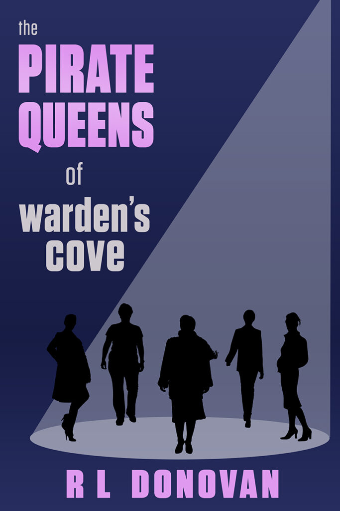
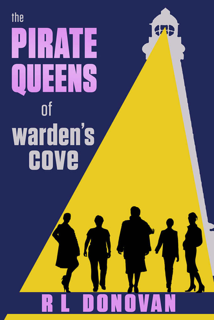
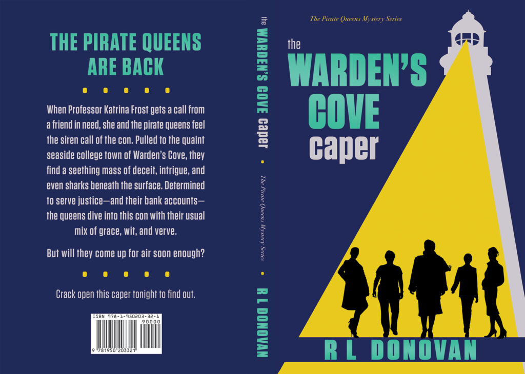
In the end, there wasn’t much question which was the best concept to continue the series. The final version had virtually no changes from the rough sketch, just a shift in text color.
While book two might not have had the broader spectrum of color of the first, it certainly had the visual impact and strong dynamic lines.
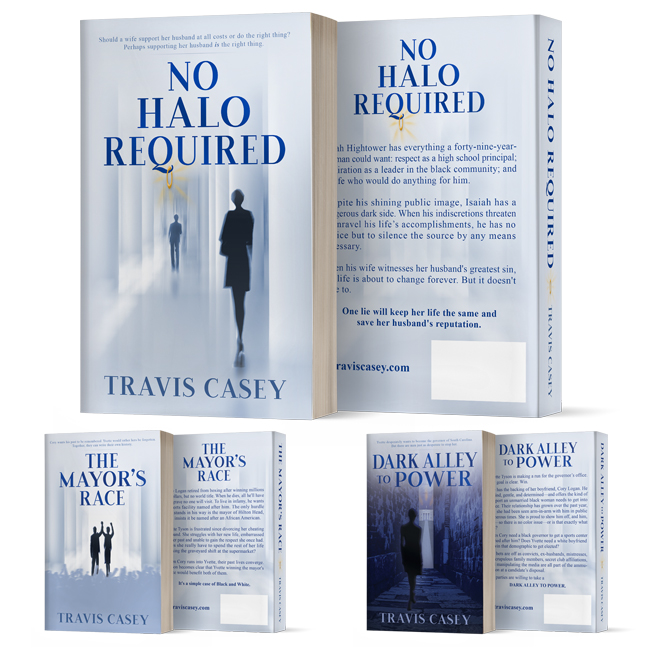
No Halo Required
The series that grew out of the book “No Halo Required” focused on the moral quandaries and grey areas in personal and electoral politics. So, in designing the series concept, keeping the iconic almost monochrome shades-of-grey look was a pretty easy call. As was isolating the pillars of the halls of power that provided a core of the visual theme.
Other aspects of the original design joined the series look as Travis Casey and I collaborated on the branding. The abstract style of the characters was never in doubt, but after trying other approaches, I always came back to distant silhouettes. This let the protagonists start as symbols of an idea, to be defined by the reader as the story unfolded. Also, even when I varied from the pillar backdrop on the third cover, I still wanted to convey the feel of a closed — possibly narrowing — path that mirrors the inevitable course resulting from the characters’ choices.
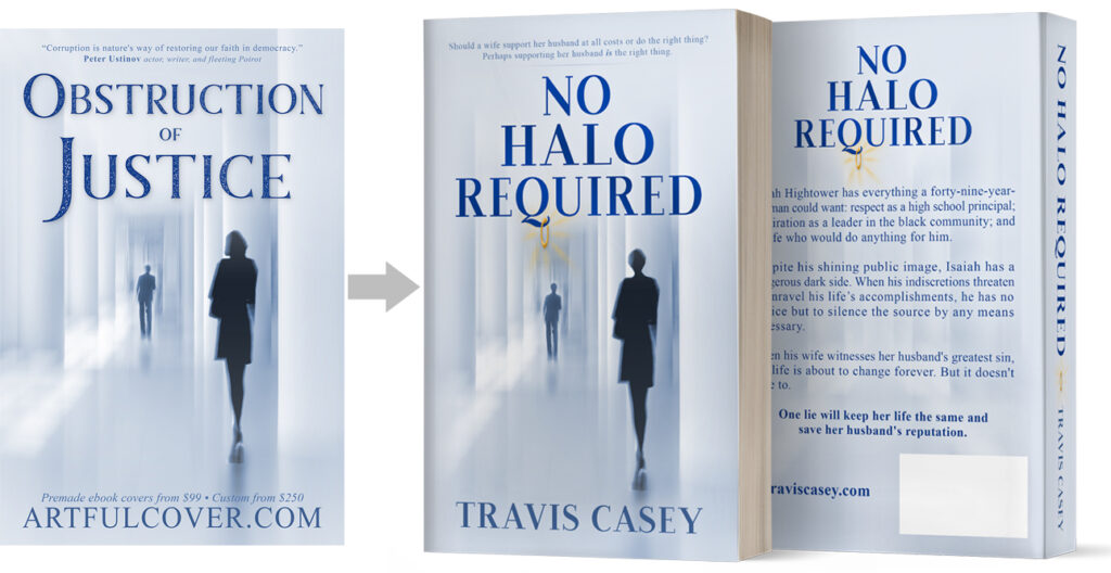
No Halo Required
When Travis Casey bought my “Obstruction of Justice” premade book cover, he needed some simple but impactful revisions. I changed the font to one with a Q that would let us hang a halo, plus added volume to the man’s hair to suggest an afro and trimmed the woman’s hair.
At the time, the project was a single cover with no suggestion of additional titles. But around a year later, Travis asked if I could carry the theme over into a new sequel.
The Mayor’s Race
The cover for “The Mayor’s Race” evolved quite dramatically from its initial concepts. At first, the protagonist couple filled the space. Then they shrank to accommodate a crowd. While appealing, both concepts felt too visually far afield from the iconic approach of the original imagery that let the reader form their own picture of the protagonists.
So I returned to the open, light abstract style of the initial cover design. In the end, even the small podium felt like a distraction, and it was also removed.


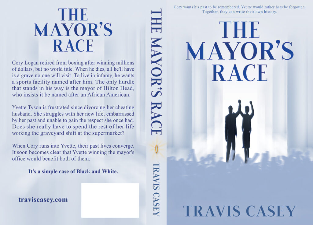
Using abstract silhouettes closer to the original cover’s scale, I brought the crowd back in to add context and scene-setting. But to stop the mass of people from detracting from the main characters, I softened the color to tie into the background pillars.
For the paperback, I also kept the halo icon on the spine to add another visual link between the two books.
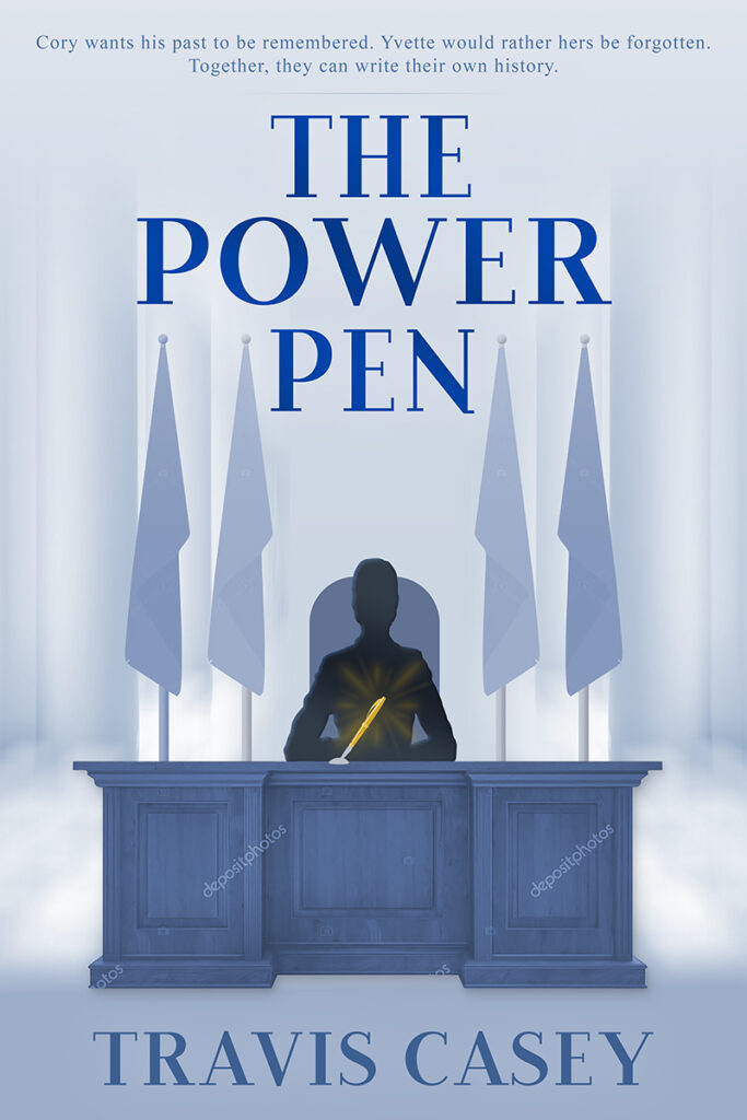
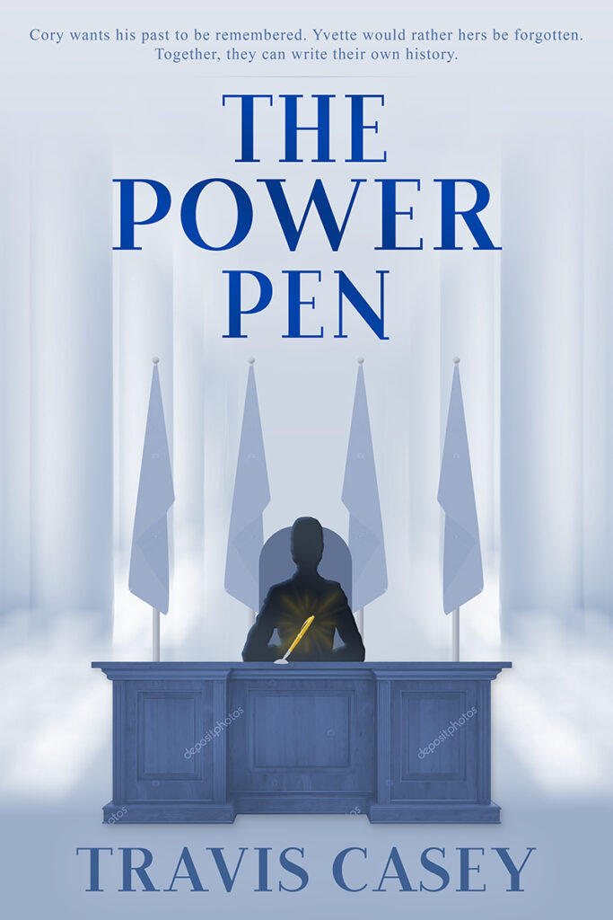
Dark Alley to Power
The third book in the series started out as “The Power Pen.” After the first round of concept sketches, Travis changed the title to “Dark Alley to Power,” a juicier and more evocative choice. One of the considerations to the title change was the natural visuals of that theme, which necessitated backdrop elements that distracted from the focal point characters.

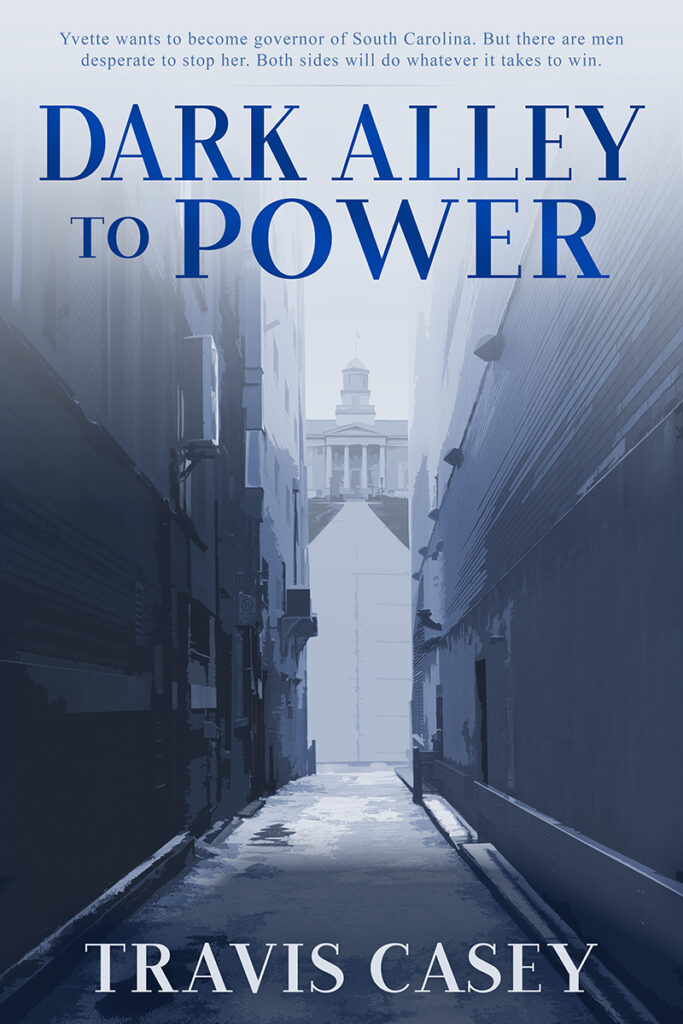
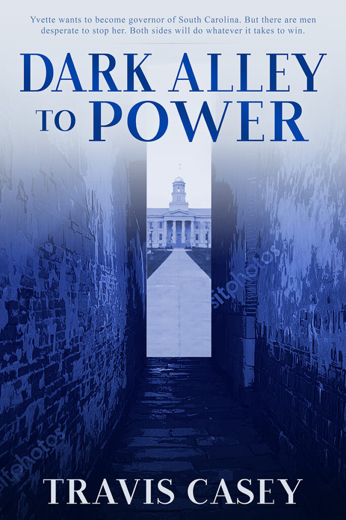
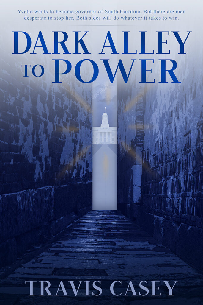
To find the right look for the titular dark alley, I started with images of the real thing. But that almost immediately gave way to a more abstract approach. Instead, I took weathered walls with a good bit of dark grunge and gave them a few rounds of filters and color treatment to tie better into the series theme.
For the light at the end of the proverbial tunnel, I used actual government buildings with various levels of filtering and abstraction. I also used the golden rays of the original cover’s halo to complete the picture.
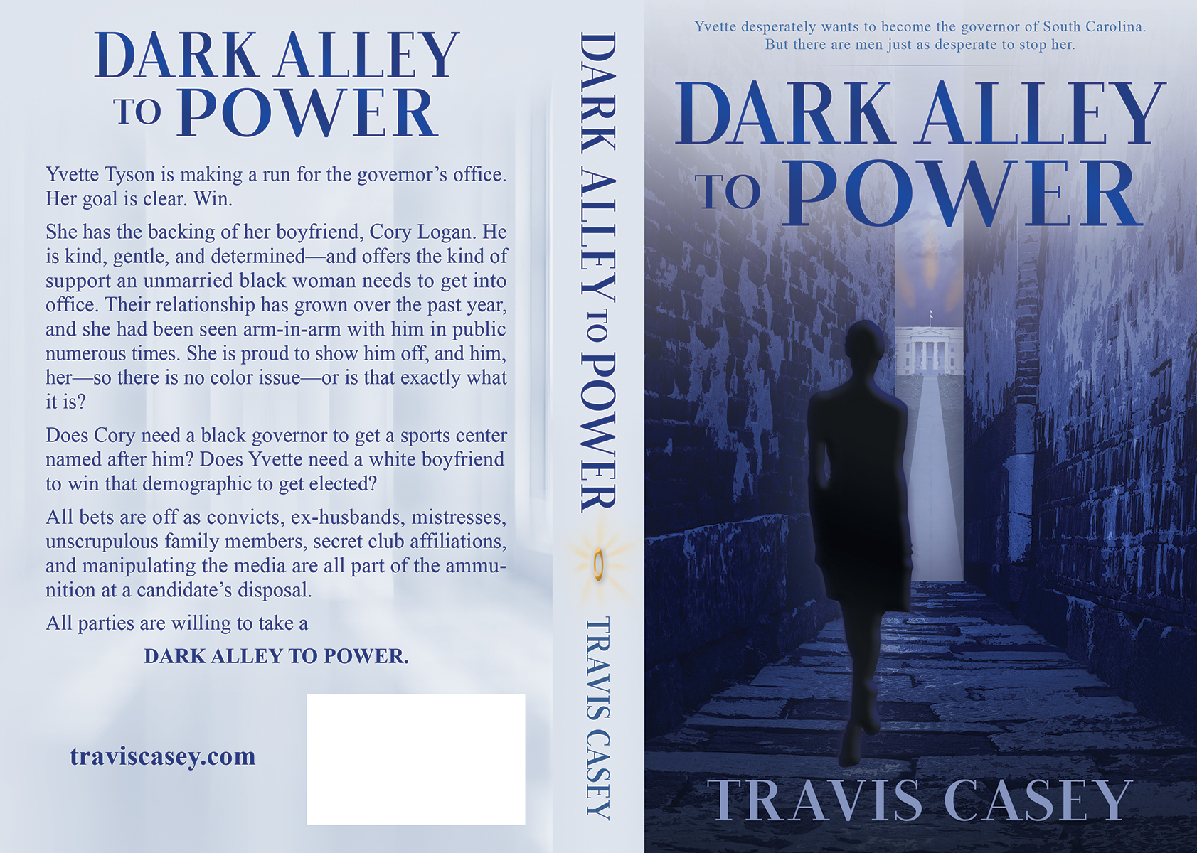
The last and most important component of the cover was the protagonist, Yvette. For this silhouette, I wanted to tie the series together in its main character and her journey. So I found a shape that closely mirrored her position on the first cover. This reinforced her as the one consistent aspect of all three covers, but highlighted the profound difference in her story over the three books.
In the first book, Yvette was peering from the shadows at her husband’s misdeeds. But by the third, she was the one leading the action, navigating through the shadows to her ultimate goal, the seat of power.
The full-circle aspect formed the visual heart of the series grounded in Yvette’s evolution.
Get In Touch!
Thanks for checking out my site! To reach me, click the violet text below to copy my email address to your clipboard or use the button to go to my contact form.